Project Scope
Witchin' Wine is a new winery founded in Salem Massachusetts in 2020. This winery is focused around the beliefs, history and love of witches. The name is inspired by a phrase used to describe something as tasting really good, "bitchin". Since bitch sounds close to witch and our wines are of high quality in taste and feel it seems fit to name the company Witchin' Wine. The goal of Witchin' Wine is to offer natural wine for anybody who is tired of unpronounceable ingredients or is apart of the Wicca community which is focused around nature. They offer not only natural and fresh wines but they also offer a supportive and informative community of witches new or more experienced.
Deliverables
~Five Wine Labels
~Tasting Menu
~Brochure
~Website ( Splash page, homepage, coven page, contact page)
~Logo
Objectives
~ To independently research, design and produce a logo, five wine labels, tasting menu, brochure and website for Witchin' Wine.
~ To apply previous knowledge of the fundamentals of design, package design, illustration, typography, photoshop and layout to all components.
~To produce high quality finished deliverables.
~To self-critique from the instructor when necessary.
~ To produce a cohesive, successful, design across all elements with great attention to details throughout.
Target Audience
The Witchin' Wine target audience is females between the ages 21-65. The audience will be geared more towards the younger end of the age range. Another component of the target audience is also new and/or more experienced witches and people that have an interest in witchcraft. Witchin' Wine will attract wine enthusiasts who have a love for fresh and natural tastes along with simple, uncomplicated flavors. This winery will also target to visitors and tourists that are passing through. Although my target audience is geared towards females between the ages 21- 65, it is a wine that anybody 21 and over can enjoy.
Research Synopsis
To come up with a successful brand design for Witchin' Wine I had to look at my competition. During my research I found that most wines have dark and sophisticated labels that are typically typography based. Most wine bottles have the same dark and drab, a dime a dozen look.
I started looking for a style that I wanted that would be fun and inviting. After a couple hours of scrolling through the explore tab on instagram, I stumbled upon this simple realistic character style. I researched how to simplify human features and body and how to replicate the style throughout. I was inspired by the different kinds of witches for the flavors so it wasn't just the stereotypical witch on every bottle. I wanted to give each flavor its own personality
Process Narrative
Logo
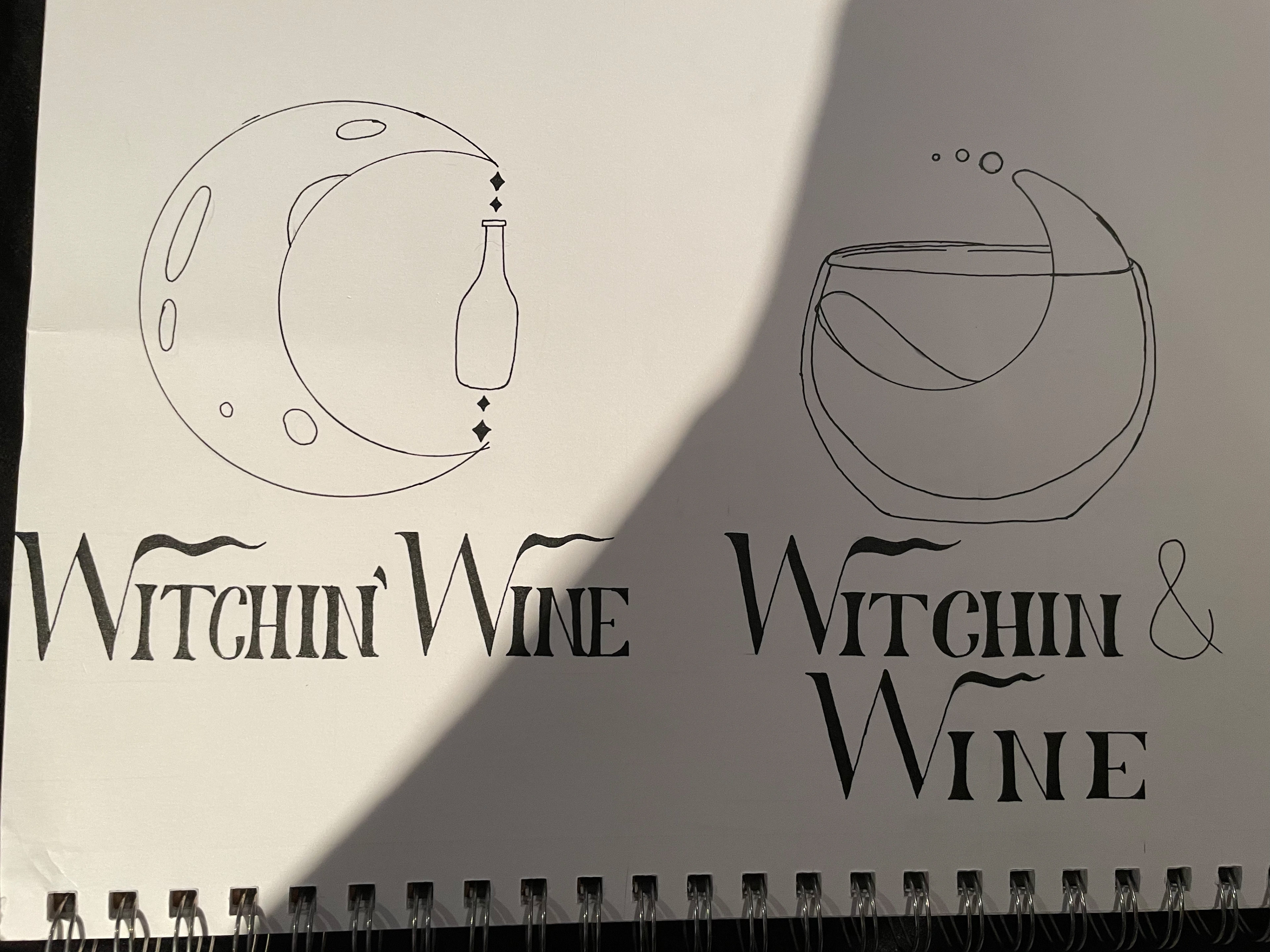
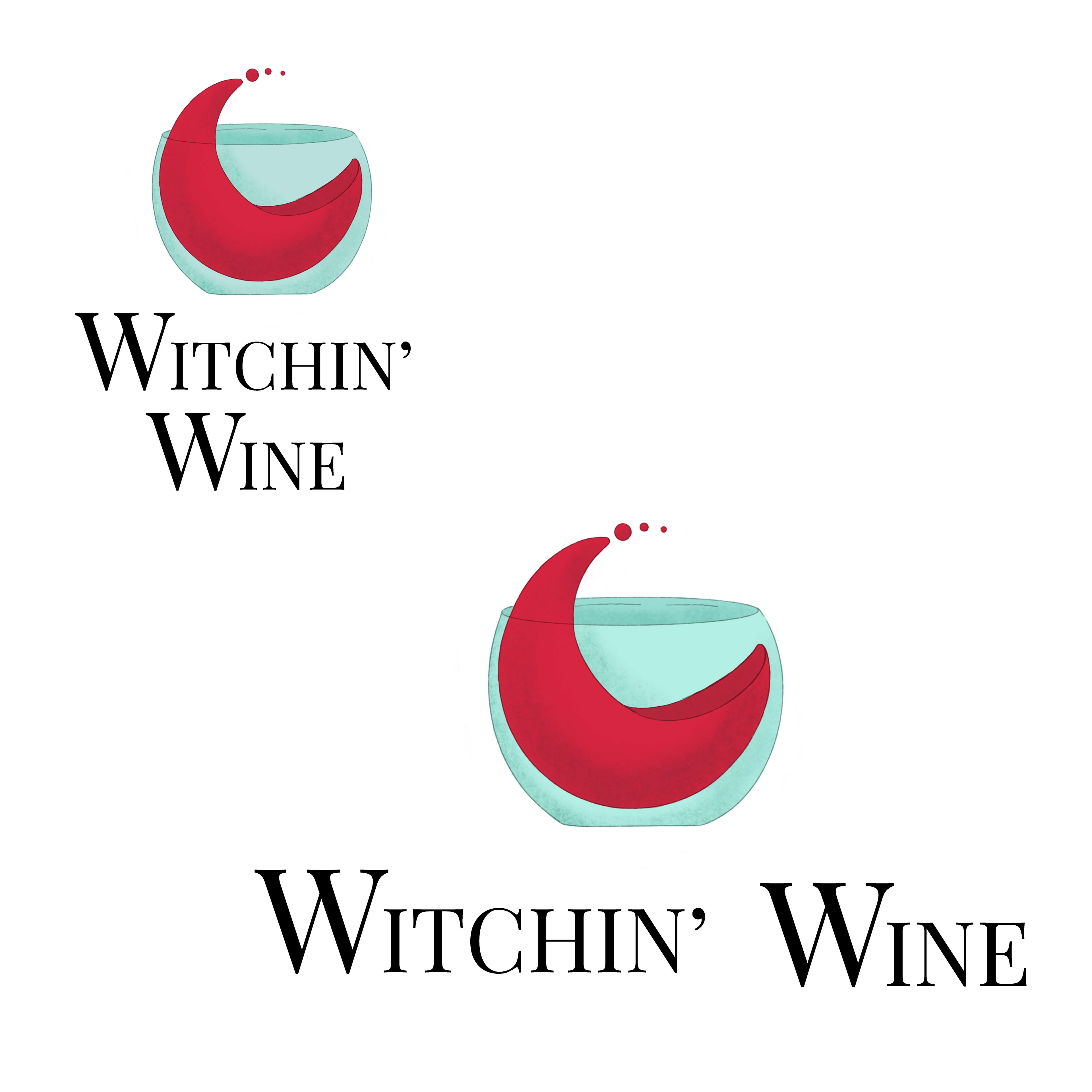
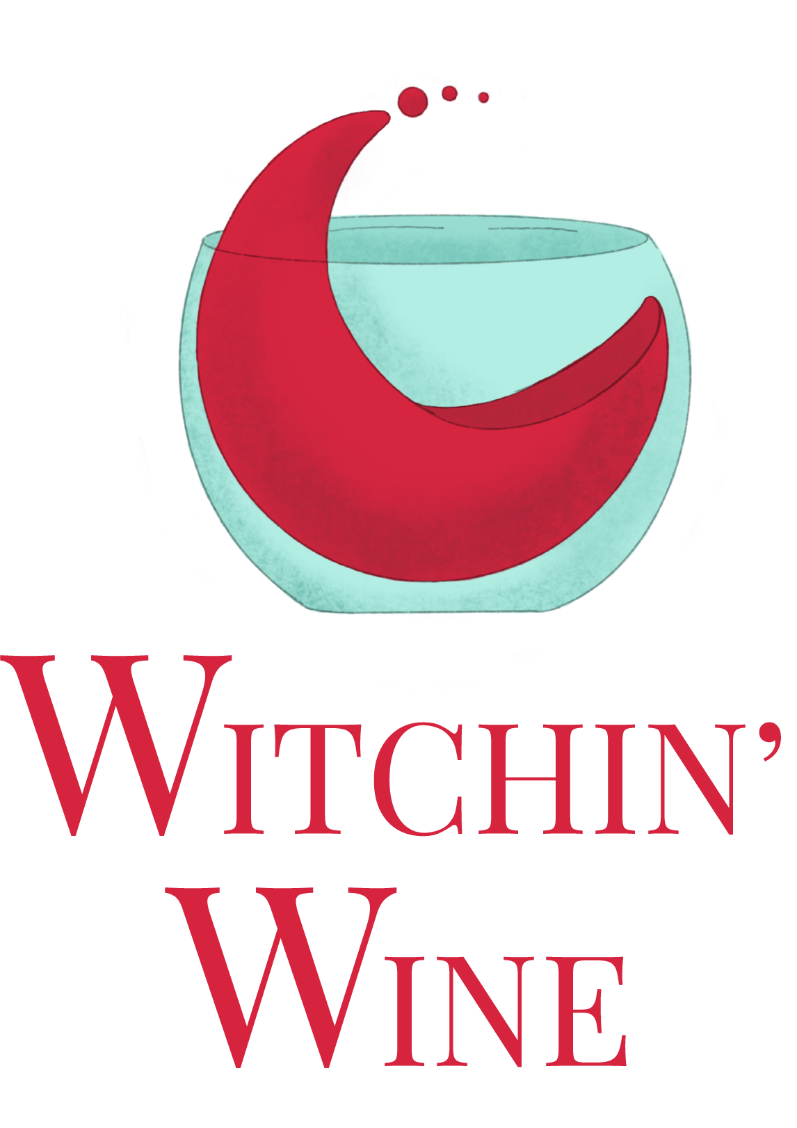
Before I could dive into the project I needed to make a logo, that will set the vibe for the brand. I began by doing thumbnails and getting the stereotypical witch things out first. After that was out of my system I thought about the wicca culture which involves phases of the moon, crystals and nature. I then took the moon idea and how I can incorporate the wine aspect. I thought about how wine curls up when you pour it in the glass and used that idea. Instead of traditional stem wine glass I wanted to keep that smooth curve and used a stemless glass for the wine to go into. Now I have the graphic but now I need a typeface. I wanted something whimsical yet classy. It took a few tries until I settled on Playfair Display.




Processive Narrative
Bottle Labels
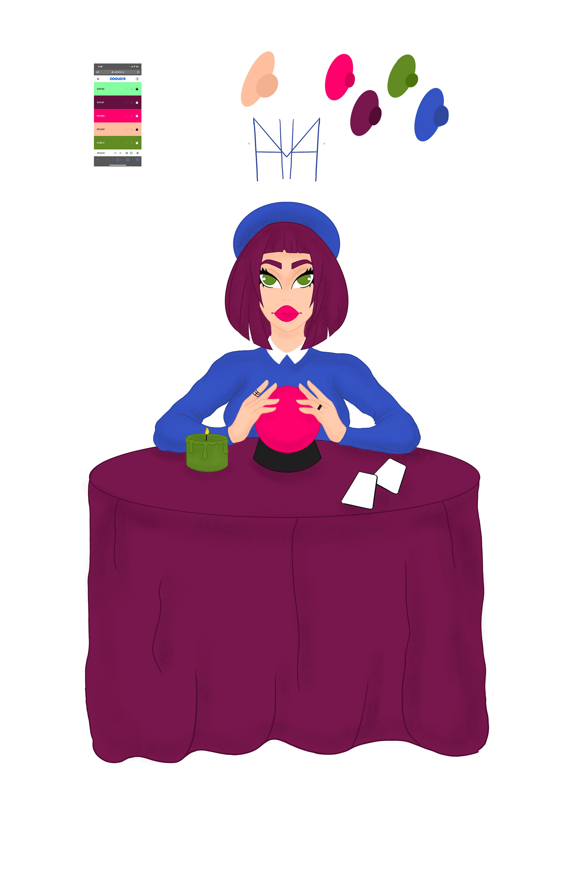
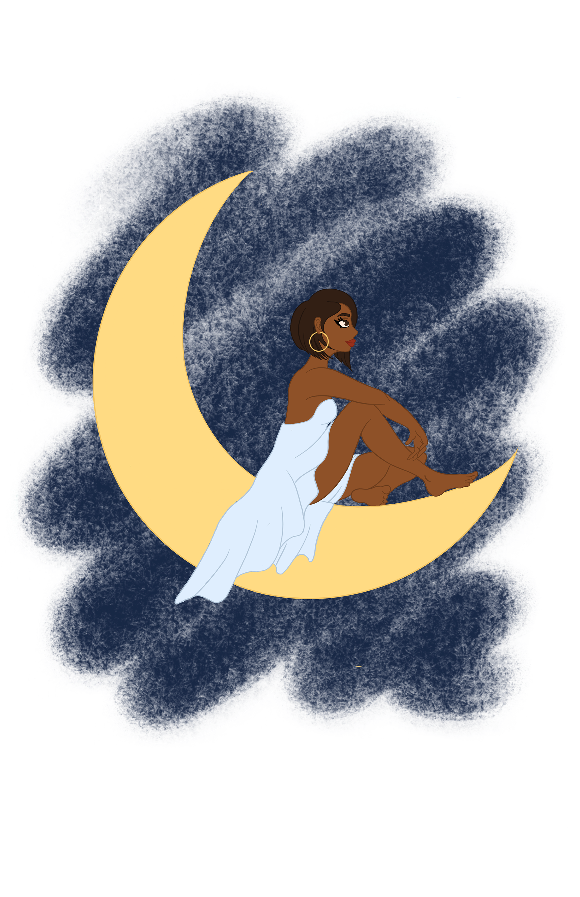
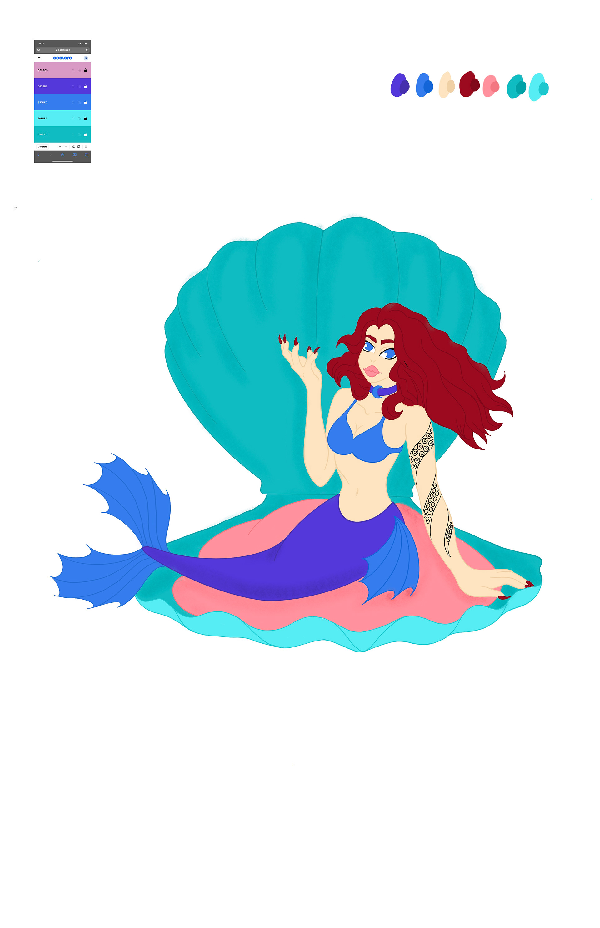
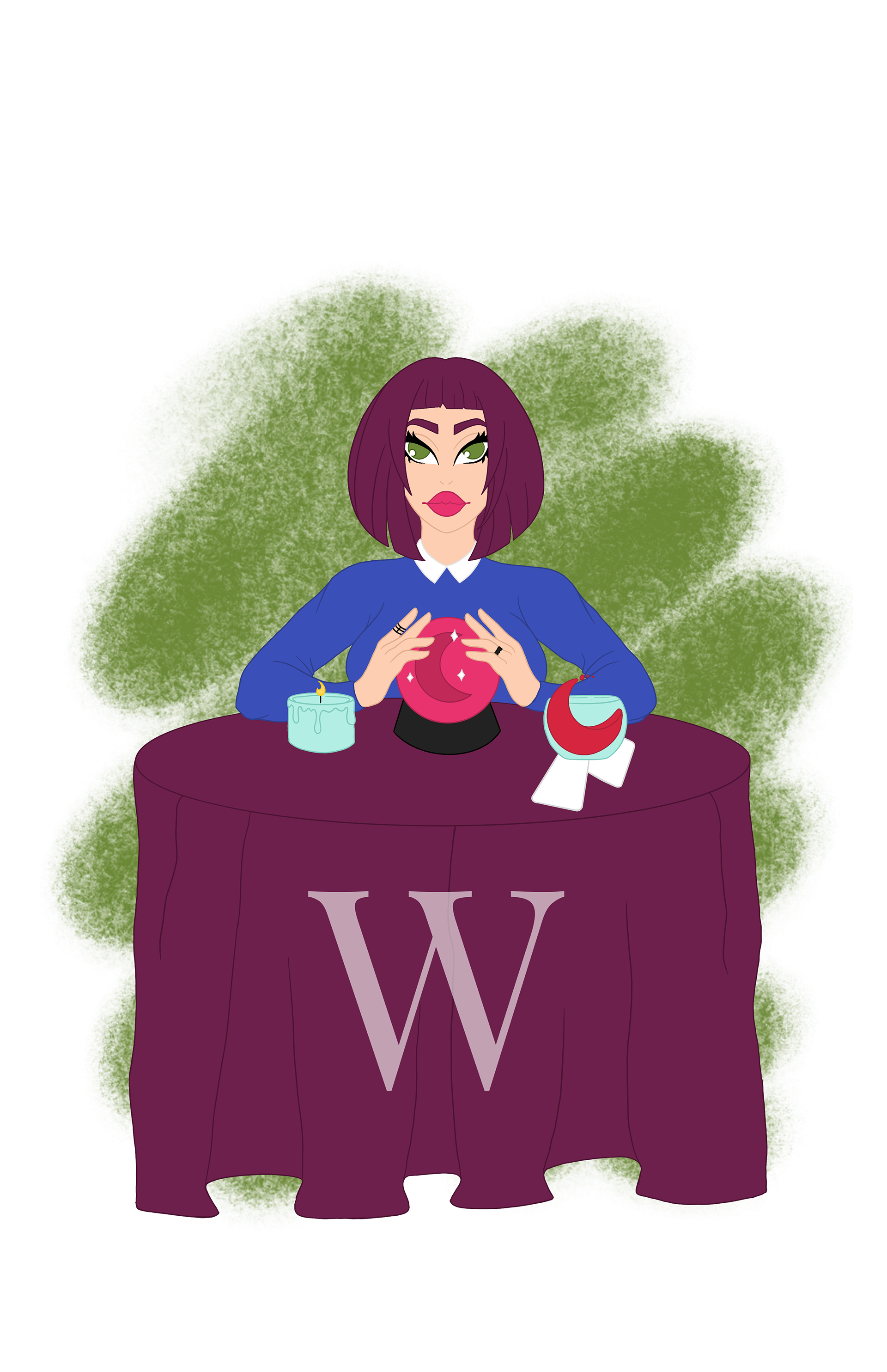
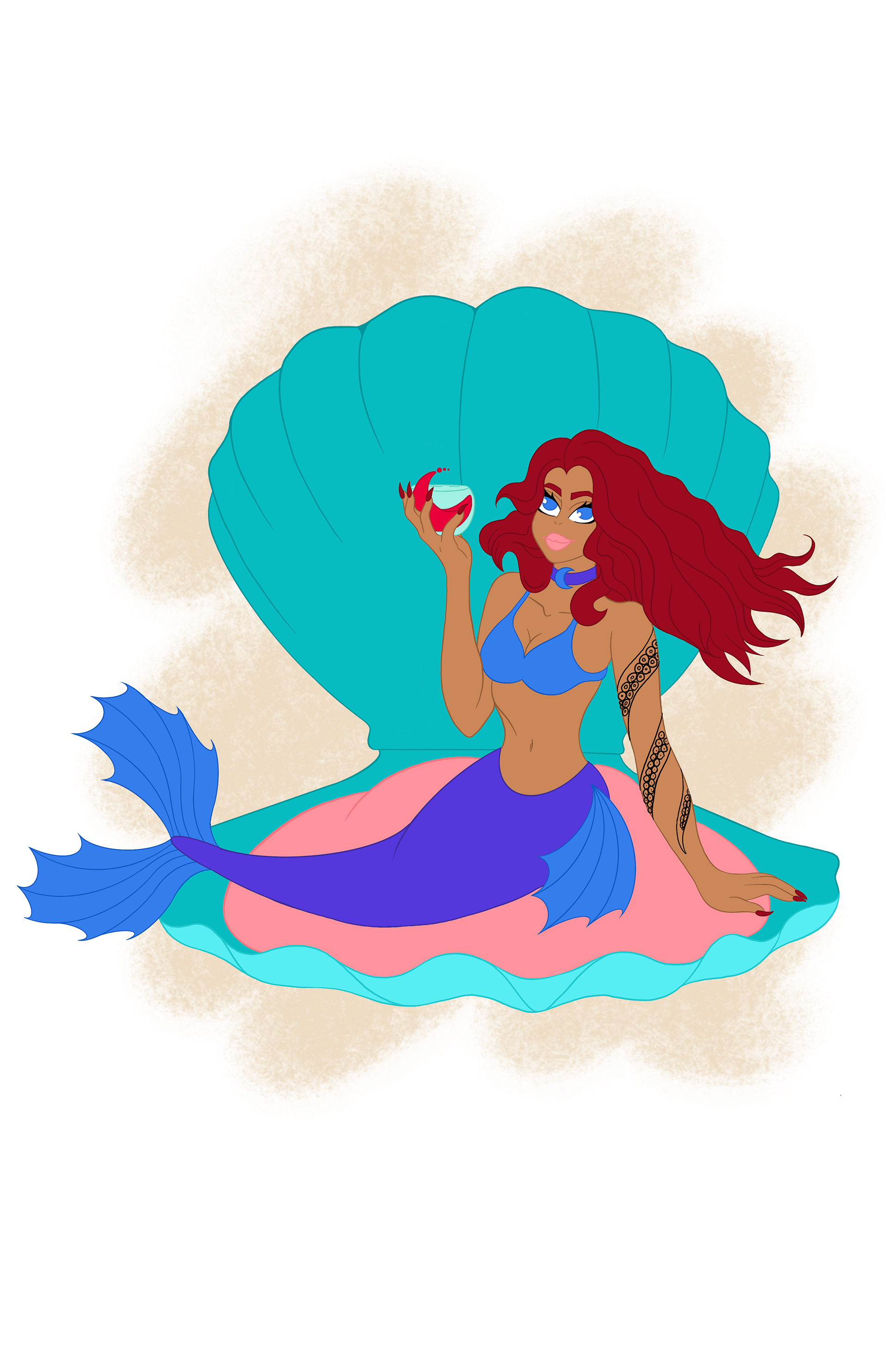
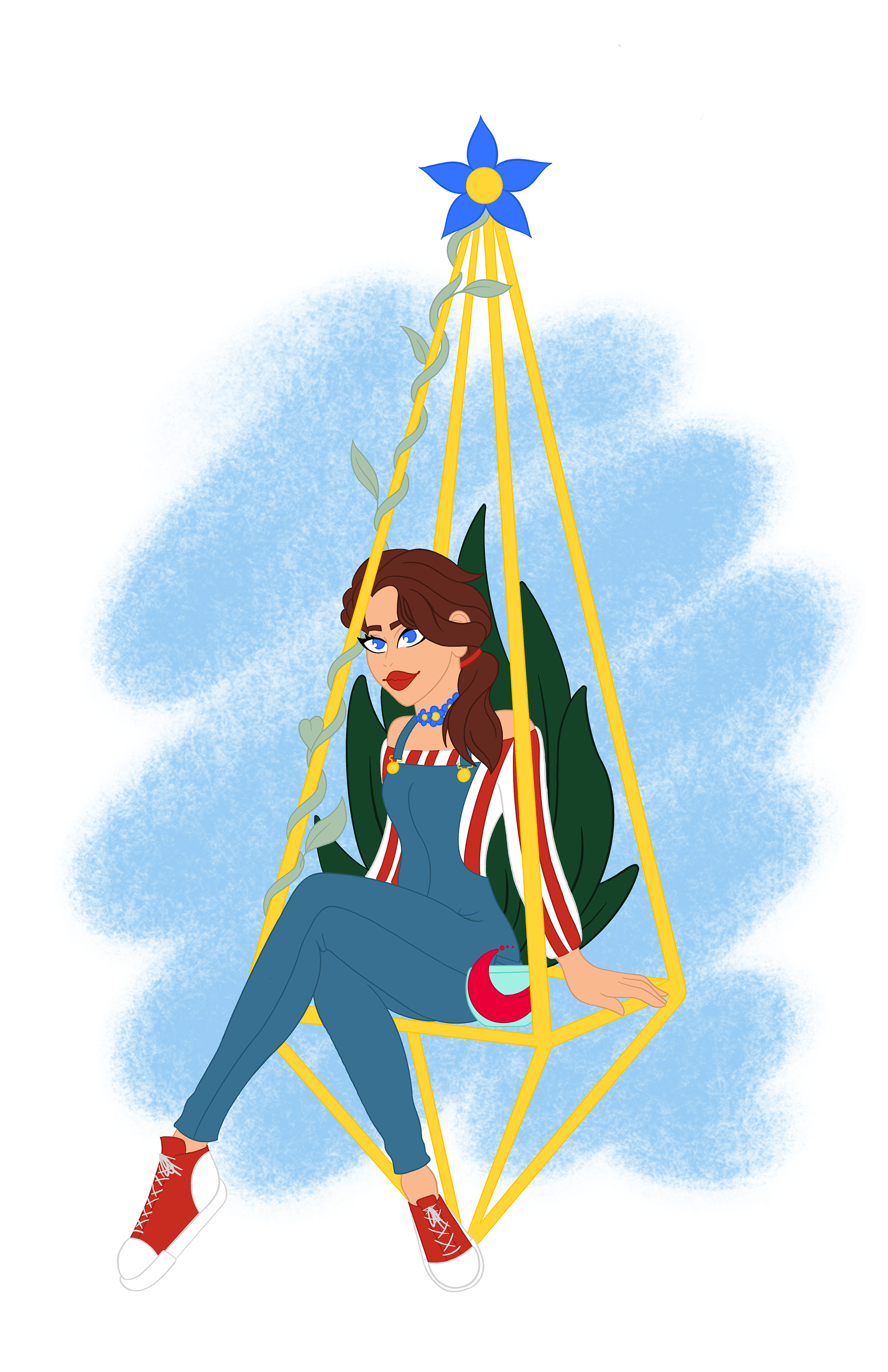
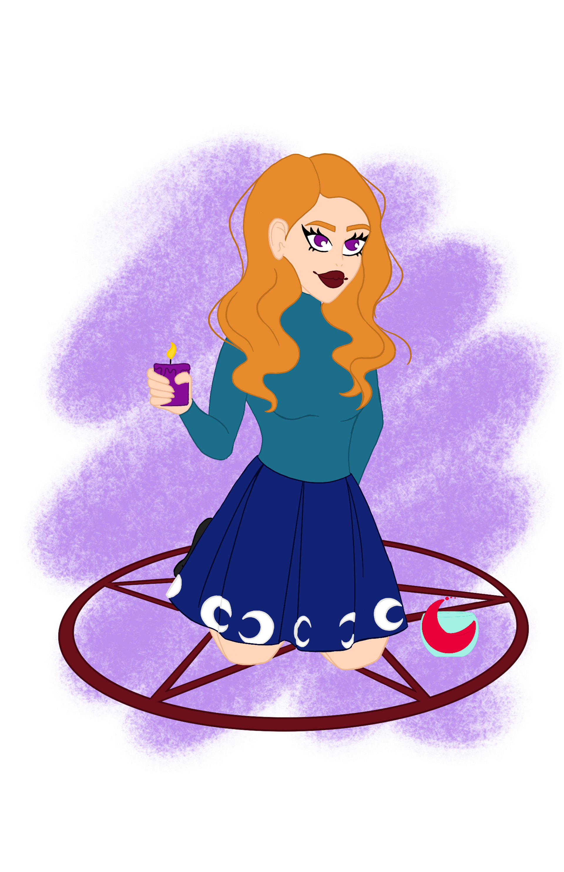
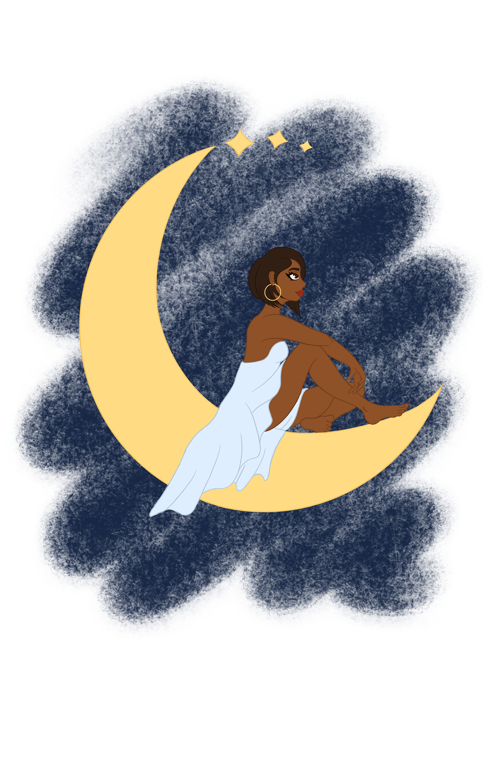
I knew from the beginning I wanted to do illustrations and create characters the embody a type of witch. In my thumbnails I thought about including whole body and some environment then my second idea was just a portrait of every witch with its corresponding flavor. I really like the whole body idea. Once line work was out of the way, now i had to add color. For the colors I wanted to them to relate to the flavor for each wine so you could pick it out more quickly. For type on the bottle I wanted to have a font family with different weights for variation and I wanted it to be thin body like a wine bottle and to contrast the wide main type face in the logo.

Process Narrative
Website
Looking at the other wine company websites and one thing I noticed with them is how undesigned and static they are. I wanted my website to be different than other wine websites by using a grid system and followed the grid throughout the site. I also wanted to add a social aspect to the website so there could be communication with other witches in the community or if someone is dipping their toe into the wicca culture and want correct information. I made the website look crisp and clean that matches the wines flavor .
Tasting Menu
In the beginning I had no clue what a tasting menu was. I looked it up and decided to go in the direction of "If you liked these... you'll like..." I wanted the tasing menu to be sent with the wine or given to the customer after buying any of the wines so people could see what else they have. The tasting menu isn't just a plain rectangle, its the shape of the logo. On one side there was the logo then on the other side you have the other wines with information about the wine.
Brochure
For the brochure I wanted it to provide information about the wine company like what wines there are and how Witchin' Wine started. The wine flavors were put in the brochure since those are the ones that are kicking off the company. The brochure includes reviews from professionals in wines. I used the logo for the cover with a photo in the wine part of the graphic for interest. The logo was a better route then a photo it allowed more room for typography.
Organization Profile
Witchin' Wine
666 Witch Street Salem, Massachusetts
witchinwine.com
Established in 2020
Witchin' Wine was established in 2020 in Salem Massachusetts by our founder Cordelia Wells. Ms. Wells made Witchin' Wine after sitting in a coven meeting with her fellow sisters wishing for a more accessible natural wine. Cordelia came up with five flavors to start her company. Along with wines, Cordelia provides a supportive and informative community for new and more experienced witches of all kinds and skill sets.
Witchin' Wine obviously value the wicca community and religion but they also value nature and how to protect/preserve it for future generations. Another group that Witchin Wine values is the LBGTQ community along with the black lives matter movement. A portion of their profits goes to various organizations for environmental conservation, LBGTQ organizations and human equality organizations.
In the short time Witchin' Wine has been on the shelves they have been nominated for the Decanter World Wine Award and have gained good reviews from many well known wine enthusiast magazines.
This wine company is different from any other in the case of they aren't just in it for money. The company was started for providing natural wine for fellow witches and wine enthusiasts. They also will help and support witches in need of help and guidance. Witchin' Wine stands strong for their company and community
